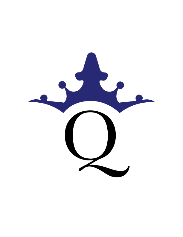
For my logo, I wanted to make something that was simple and clean. I looked at lots of large publishing companies and their designs for their brand. While researching I found that most of the large publishing companies that are clean, modern, and sophisticated, so that is what I wanted to portray. I knew that I wanted to do something with the name “crown” or “queen”, but with further inspection I realized that crown publishing group already existed so Crown Publishing Group it was. I struggled at first with the crown and illustrating it myself. But once I figured it out, I just tweaked parts of it so that it was perfect. I also struggled with the coloring of the logo. I wanted to give off a feel of sophistication without making it cheesy. I first tried the colors purple and gold to see what it looked like and I was not a fan. So I researched sophisticated and luxurious colors as well as colors that are royal. Once I figured out the colors that I like and looked good together everything fell in place. Overall, I really liked the way the way my logo came out as. I think that it could actually be used for a real publishing brand.
I thoroughly enjoyed this as the first project of the semester. I have experience with designing both logos and brand style guides, but oftentimes those experiences come with strict criteria to follow. This project allowed me to fully express my creativity by designing for a fictitious publishing company. I was inspired by the phrase “The pen is mightier than the sword”, credited to novelist and playwright Edward Bulwer-Lytton. It seemed fitting for a publishing brand, and I am overall very pleased with the result.
When creating a company, I knew I wanted to do a children’s book publishing company. When I was brainstorming a name, I tried to think of positive and happy names. I really like the name Rainbow because rainbows represent joy and happiness.
When creating the logo, I wanted to keep it simple, so I went with a simple rainbow over the word. I played around with placement with the name and the rainbow, but ultimately liked the way this looked. The hardest part was finding the right font. I wanted something fun and bubbly—something that was childish. I found Pain De Mie and I thought it worked well for this company. I chose the colors based on the rainbow but made them a little more muted than the colors of the rainbow. I kept playing around until I found the colors that I liked. I chose gray because I thought it looked better than just black. I think it gives a light and airy look to the logo. Overall, I think I did a good job with this logo. I think I could have gotten more creative with the image, but I enjoyed the simplicity of it. I enjoyed this project because I have never created a brand guide, but I had a great time coming up with the type of company and creating a logo for it.
For this project, we were prompted to design a logo for an imaginary media production company that we create. For my project, I was inspired by all of the group projects I have worked on in the media school and the upcoming spring season.
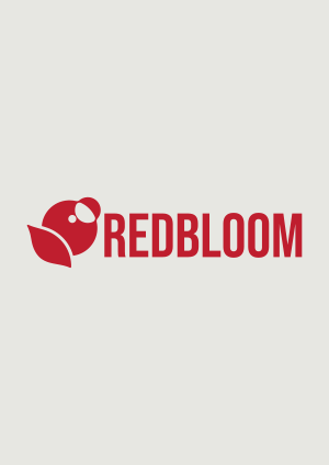
This company is based in Bloomington at Indiana University, so I named the company “Redbloom”. Bloom representing all the blooming flowers we get when it’s beautiful in the spring, and red to represent the crimson of Indiana University’s colors. I also liked the idea using camera blooms in my concept. The summers get so sunny here , and if you were to take a picture outside there might be a sun bloom in your image. That is where I took off with designing my logo.
I wanted there to be a graphic that could be used on its own, so I decided not to incorporate typography into the logo. This way there can be a logo mark which would look great up in the corner of the website search bar in a browser, as well as there being horizontal and more vertical variations which maximizes the opportunities of where the logo can be used.
For the graphic itself, I created a camera bloom/shine/reflection that is supposed to mimic a budding flower. It is accompanied with a leaf to tie together the idea of budding flowers. For the typography I found it appropriate to keep it simple, bold, and sleek. I find that it looks professional and ties in well with the simple graphic.
If there would be any thing I would improve I would like to stylize the brand guide more. I struggled with taking the professional and sleek aesthetic and making it into a stylized brand guide because this aesthetic is out of my comfort zone and not what I am normally designing like. However my favorite part of my brand guide was including a section that explains the design choices by pointing to specific parts of the logo. I feel like that would be a great way to communicate my intentions and decisions as a designer to a potential client.
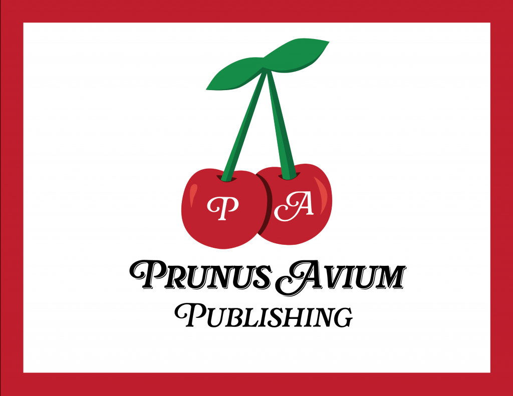
For our logo project, I created Prunus Avium. Overall, I had a lot of fun creating this. At first, I had too many ideas and couldn’t choose one. Once I started drafting concepts for those ideas I began to struggle to come up with logos that had character and still kept it simple. I ended up landing on cherries.
For my logo, I decided to stick with the classic cherry icon of two cherries with their stem. When thinking of names I had the idea of looking up the name of the tree cherries grow on. That’s where I found Prunus Avium. I liked that the name, from my perspective, is not well-known by everyone and it sounded professional. After figuring out the name, I added the P and A to the cherries to try and differentiate my logo from just a basic cherry. Also, because of the name I added a small tree stem.
I of course wanted to stick with the basic cherry colors: a darker red, lighter red, green, black, and white. For the font, I wanted something that felt upbeat and happy yet still kept it somewhat professional.
This project was a great learning experience and I enjoyed creating this logo.
For this logo project, I began brainstorming ideas that could be related to publishing in some way, yet be something almost completely unrelated and I wanted to achieve this through a clever design. It was really important to me that the logo and name I chose was meaningful to me as well. After many brainstorming sessions and ideas later, I landed on Tiger Lily Publishing. I chose this because I liked how it sounded, there are often wild tiger lilies where I’m from, and my sister’s name is Lily. I also chose this idea because as I was initially sketching, the logo gave me an outlet to relate it to publishing and it is visually interesting.
For this logo, I wanted the vibe and brand voice to be traditional and elegant, yet bold. Therefore, I used a bold orange tone for the flower, which I think goes nicely with the name of the company. I began designing my logo with a flower as the visual, specifically a tiger lily, which consisted of orange petals and black dots. I really liked how the black dots looked on the flower, but once I landed on the idea of making the petals an open book, I thought it would be more effective to use stripes on the petals to represent both pages and tiger stripes. I chose this typography because I love classic serif fonts and I made the first letters of tiger and lily bigger for more emphasis. My goal was for the logo to have simplicity upon a first glance, but as the viewer looks deeper, I wanted it to be clever and have an underlying purpose and meaning.
Overall, this project was challenging, but definitely improved my graphic design and ideation skills. The most difficult part for me was deciding on a final logo out of my different versions, but I ultimately went with the one that had the most meaning and was the most visually appealing out of all the options. Since I will be using this logo to animate and put on my website for this class, I wanted it to align with my personal brand and how I like things to look. I think I achieved this well and it was a rewarding assignment.
For the logo project, I wanted to create a minimalistic design for a publishing company. I came up with the name “Ivy Publishing” because I love plants and thought that the symbolism of ivy representing growth would be a good theme for the brand. I also love the color green and thought it would be interesting to use this to create a brand voice that was friendly and welcoming.
I went through a few versions of the design before landing on the final product. I knew from the beginning that I didn’t want to make my design too illustrative or detailed. I also thought that it would be interesting to create the appearance of the word “ivy” within the design as part of the shape of the leaf. I came up with another version before this one that incorporated this idea, but I felt that it was still too detailed. I also realized that since I would be adding typography to the design that this effect should be as subtle as possible. I came up with the current design on a whim and thought that it had potential. I worked with the text a bit to develop the logo as a whole. Since the leaf shape was very simple, I thought the typography needed a little more emphasis to make the design seem well-rounded.
Throughout this process, I learned that coming up with an idea is the hardest part. Many of the ideas that I thought would work on paper ended up not working out as well when I tried to create them in Illustrator. The brand guide was also something that I had a difficult time with at first. Because I was starting from scratch and had never done a brand guide before, I wasn’t sure how to structure it. Once I came up with an idea for how to theme it, putting the guide together became a lot easier. After completing this project, I feel I have learned more about InDesign and Illustrator than I knew previously. Having an idea, and then learning how to create it, was a difficult but rewarding process.
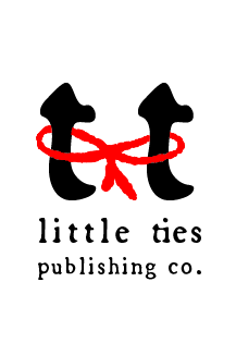
The beginning of my design process for executing the logo and brand voice for Little Ties Publishing Co. was to first begin to think of how I wanted my work to feel throughout the course of this semester. This publishing logo will be present on all the work I submit throughout J465 so I knew I wanted it to “tie” in with the look and feel I wanted to portray in the upcoming projects. My design style is simplistic, bold, sensitive, and clear. I wanted this to translate into my publishing company’s visual identity, so I began brainstorming names that I felt accomplished this. Some names I was debating between before settling on Little Ties was Innocent Hand Publishing Studios and Do Not Disturb Publishing. But something about them felt either too sweet or too rigid. The publishing company’s purpose is to be the connector between works so I felt that Little Ties represented that in a concise, sensitive, and simple way.
Once decided on the name, I began to sketch out ideas of how I could cleverly represent the publishing company’s purpose, which was to connect the work produced through the course together, and the people viewing work to the work. I really enjoyed the delicacy and simplicity of a small red bow and tried many ways to implement that visual motif into my design. I decided on the color red because of its classic feel and eye catching quality. I wanted my logo to be distinct yet subtle as to not take away from the rest of the work that it will live on in the future of this course.
One of the reasons why I enjoyed the name Little Ties so much was because of the double “t” in the word little. I felt that those t’s could be easily personified. The personification of the two t’s to represented as two people connected was how I want people to feel when they view all of my work; to feel a sense of empathy and connection to a greater message.
I fell on the font choice of Broadsheet, which is an Adobe font, because of its classic old novel feel, while still being incredibly legible and simple. I appreciated the character and timelessness that it gave, while still retaining a bold presence when enlarged.
Overall I had a pretty effortless process when creating this logo, which is mostly due to nailing down the voice, feel, and purpose of the brand before going into the creation stage. One thing I did struggle with however, was fighting back and forth between it being too simplistic, and wanting to add more. I feel confident with the balance that I have created with this design, but its something that caused me to go back and forth on designs for a while before setting on this one.
Click the image to view the Modern Love Productions brand guide.
I identify Modern Love Productions as energetic and retro – fun-loving, but with a touch of class. The logo, in all its elements, reflects that personality.
The name for Modern Love is a tribute to a personal and creative inspiration of mine, David Bowie. The song “Modern Love” is one of my favorites for its playful sweetness and lively energy, and I wanted to reflect that in the brand personality without sacrificing professionalism. I wanted to make a design that felt retro and classic but could still prove itself as cutting-edge and creative. I also wanted to make it clear that the brand isn’t just about what’s on the surface – that it’s grounded in care and passion. To me, Modern Love as a phrase represents all of that.
The pink and blue shapes form the distorted shape of an ‘M,’ for Modern, while inside that, the outline of a heart represents Love. The ‘M’ also looks like the hands of a timepiece (this is most obvious when placed against a circular background) which signals the brand’s connection not only to what’s currently thought of as modern, but also to the past and future of design. Furthermore, the line that separates the two rows of typography repeats the sharpness of the outside of the design, but its rounded ends are similar to the softened corners and edges of the logo’s shape.
The high contrast of the pink and blue/purple colors is inspired by the bright, shape-based pattern design of the 1980s. But the muted scheme is also lush and romantic in a tribute to the impressionist artwork of painters like Claude Monet. The dark gray in the typography is softer than a harsh black, and conversely, the creamy off-white softens the design against an inverted background. That softness is meant to be comfortable and friendly – more ‘love’ than ‘modern.’
The alteration of Playfair Display Black in the logo provides an air of sophistication that keeps the logo’s classic sense. The use of a Serif typeface adds a traditional sentiment, but Playfair is anything but outdated. The adjustment to the text – making the letters more vertical and closer together – is meant to reflect and balance the sharp, vertical nature of the logo itself.
On the whole, this project presented a new type of challenge for me. I’ve done some logo work before, but usually, I’ve had a starting point – a personality and some other elements that the client wants represented in the final design. For Modern Love, I challenged myself to create something personal to me, drawing on the kinds of design and typography that I love most, but still keeping the design professional and cohesive. I went through pages of sketches of a previous idea I was sold on before I realized it just wasn’t working how I wanted, but after I let go of my first idea I was able to explore a lot of different possibilities. I’m especially proud of the blend of positive and negative space I brought into this logo – I have always found it challenging to invoke that kind of visual play, and figuring out how to do so effectively was a goal that I set and met for this project. I’m quite proud of the finished design, and I think it’s a good reflection of who I am right now as a designer and what I’m capable of creating.